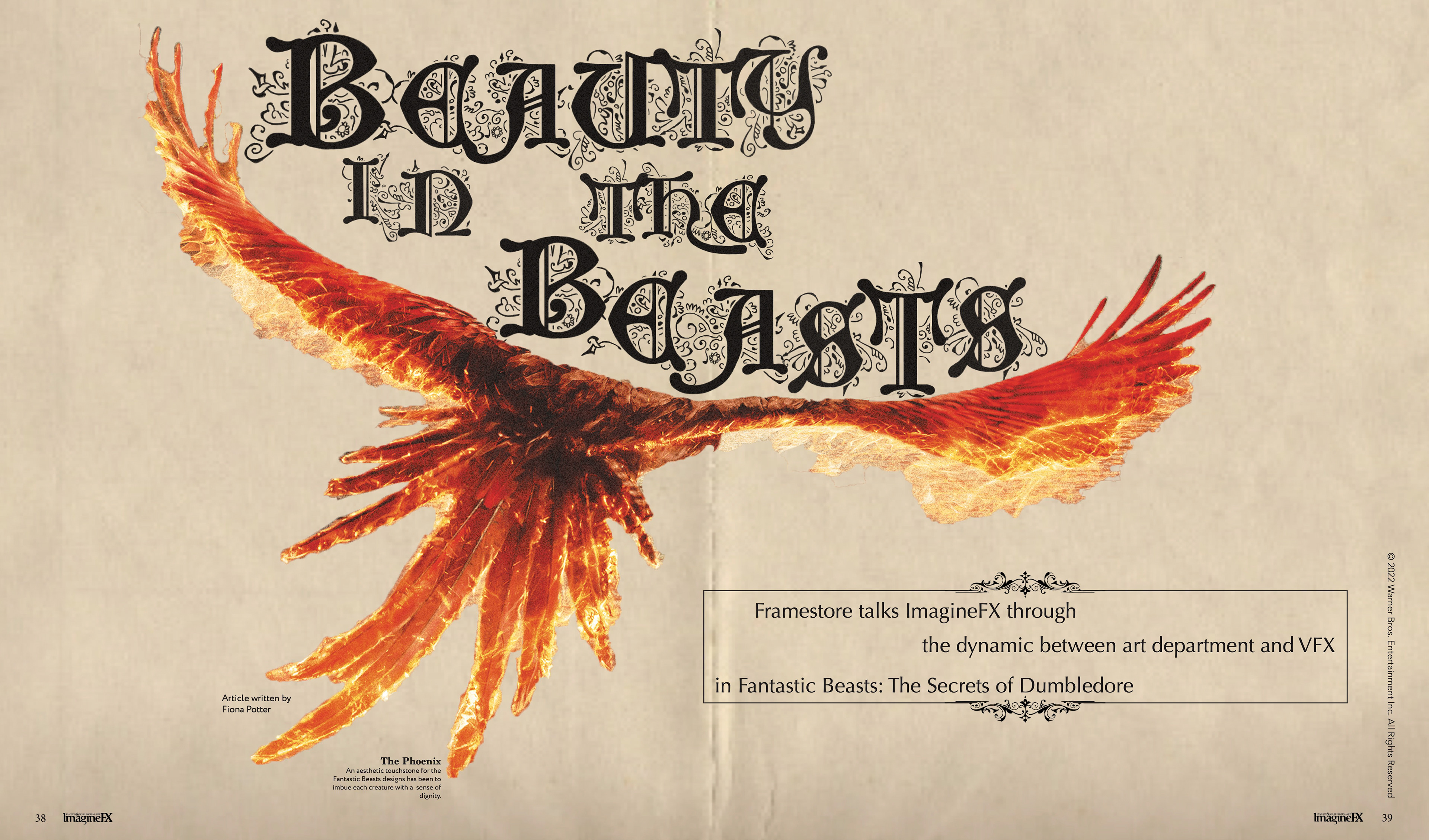
First page of the final project.
Second page of the final project.
Third page of the final project.
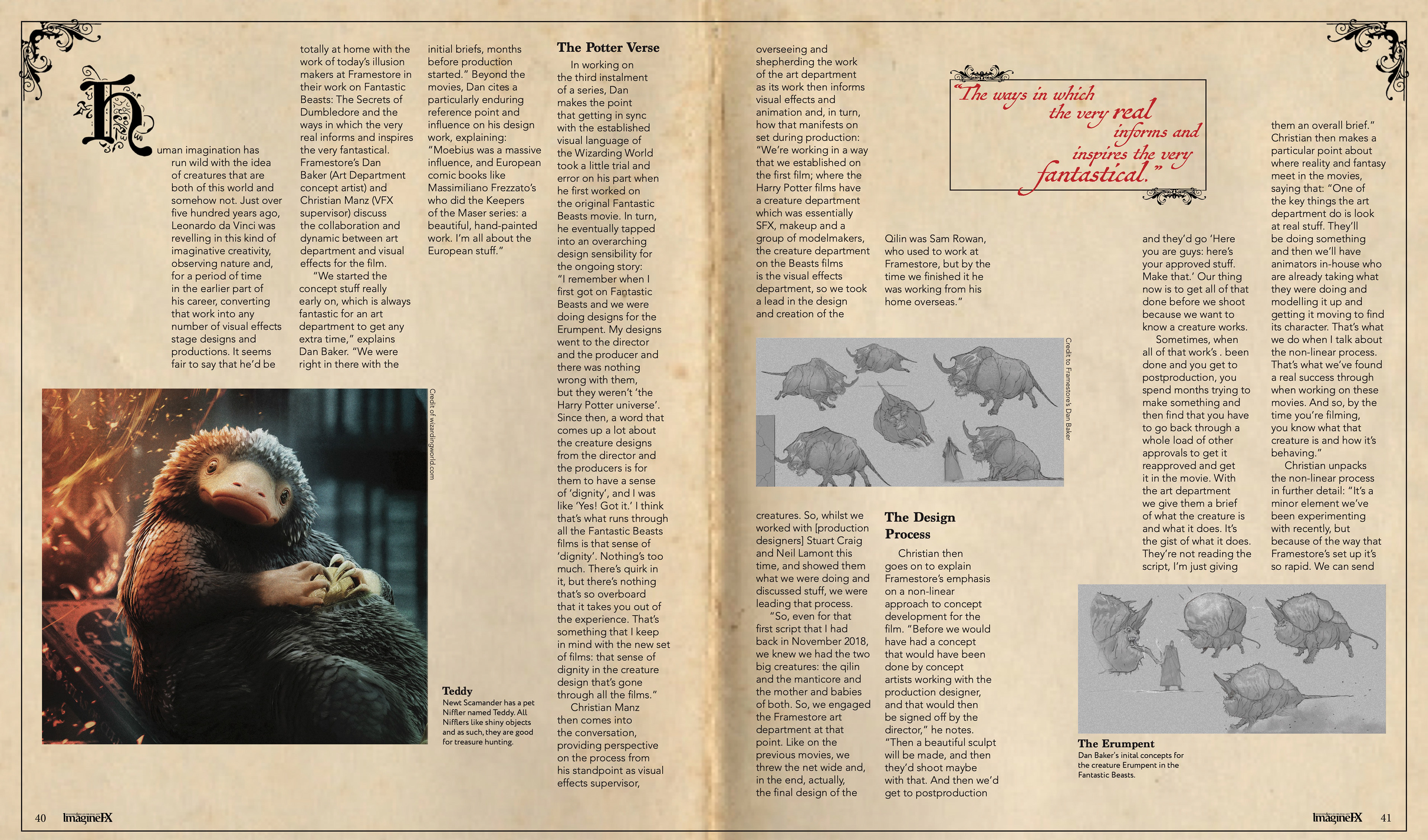
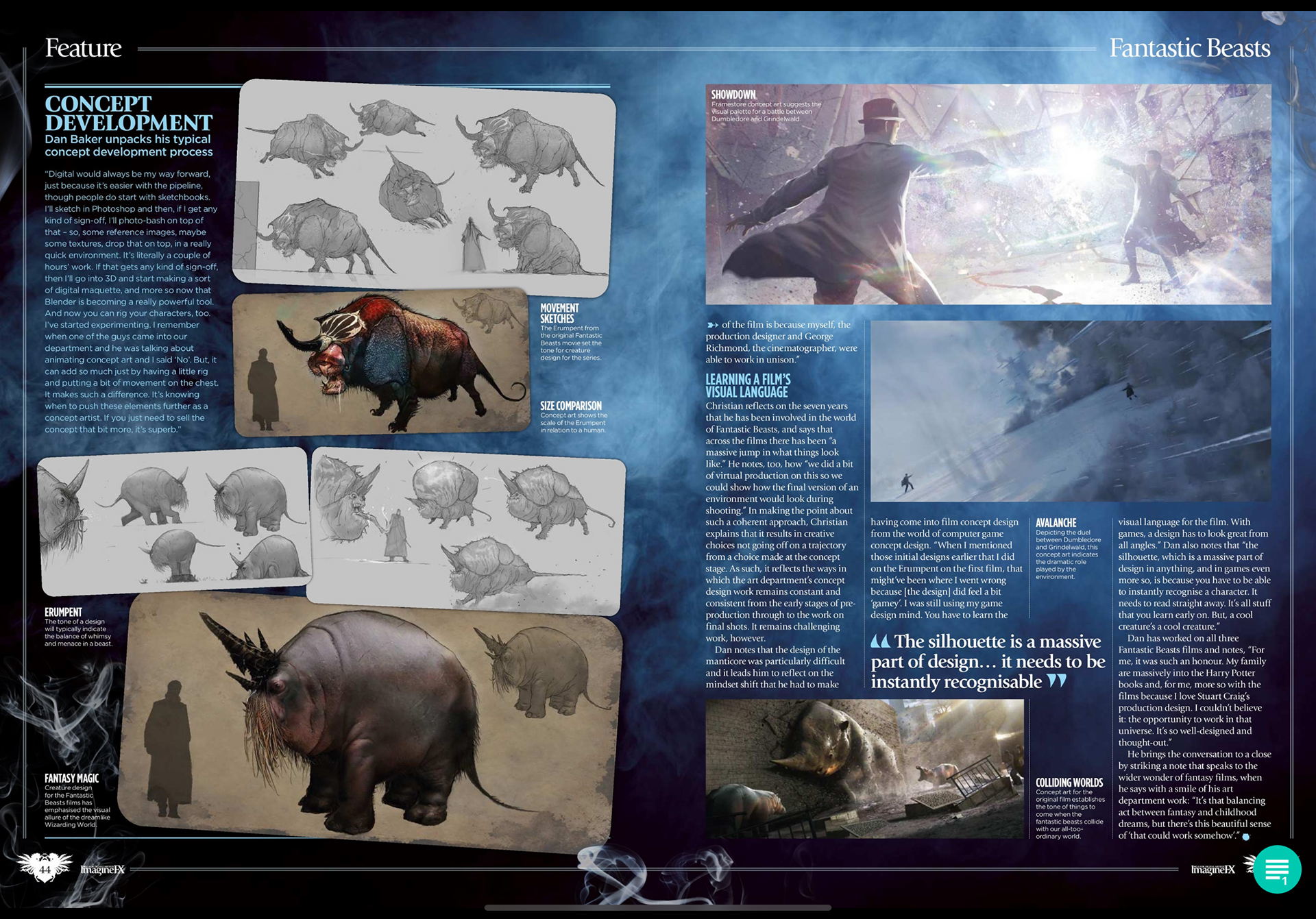
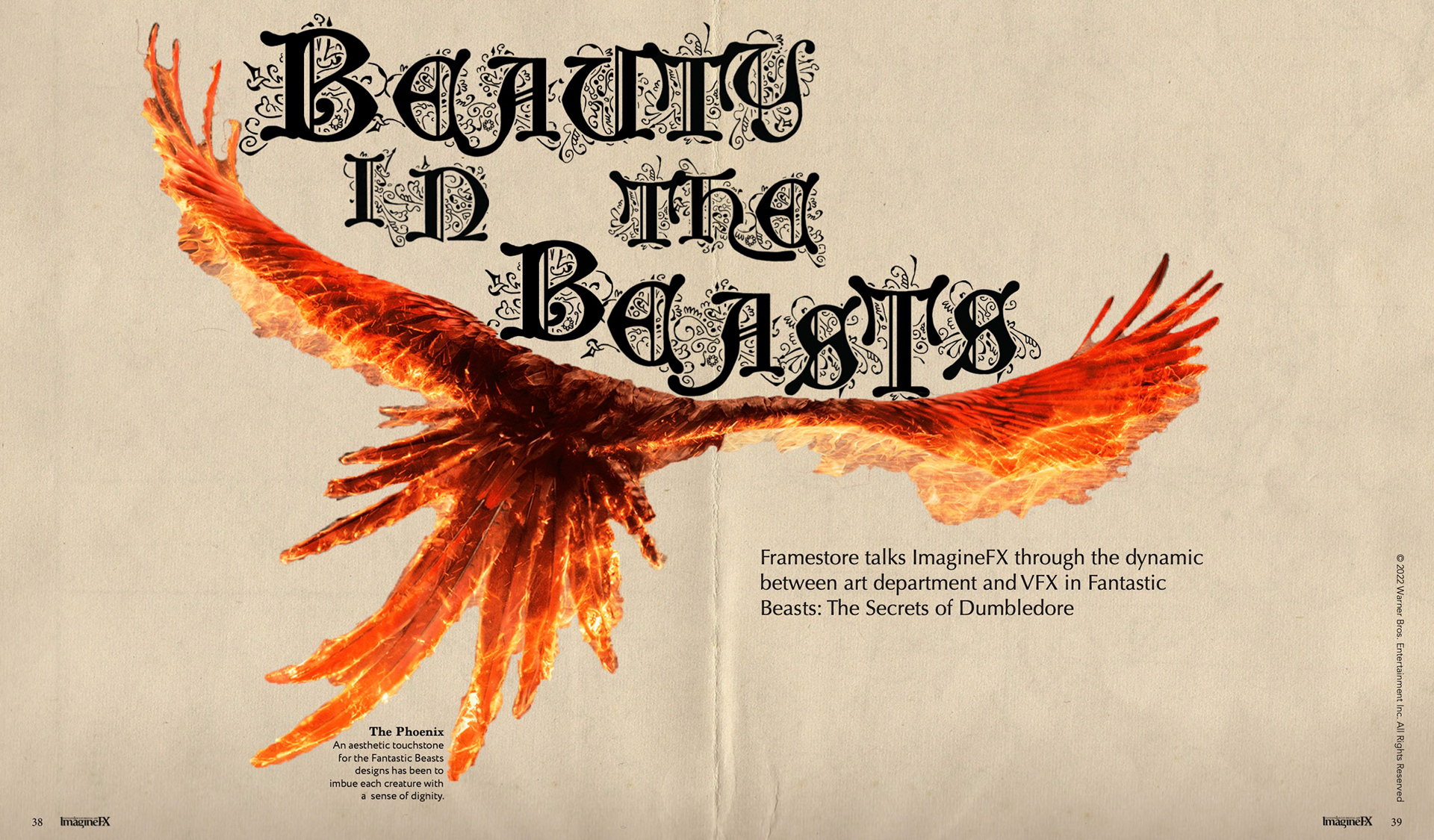
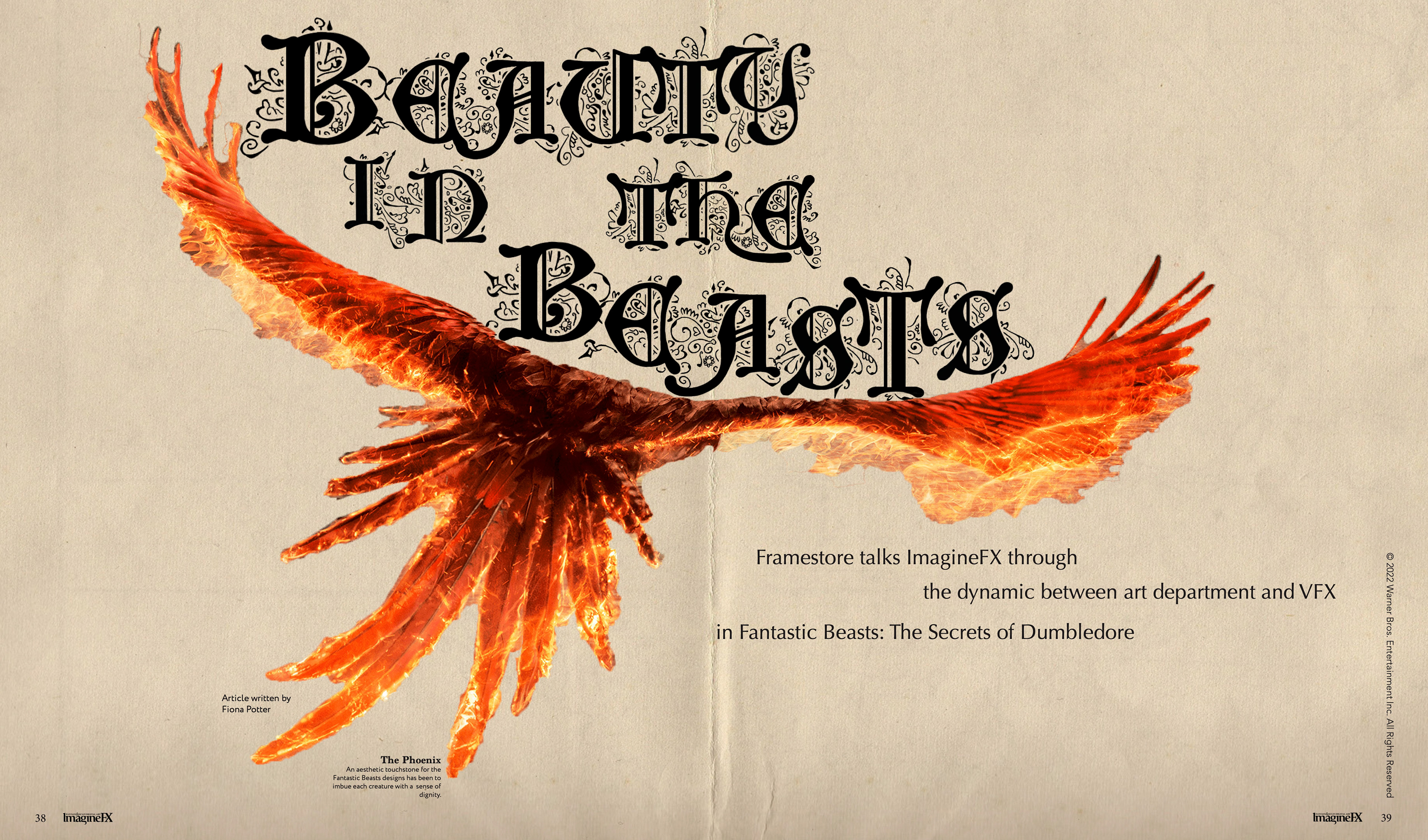
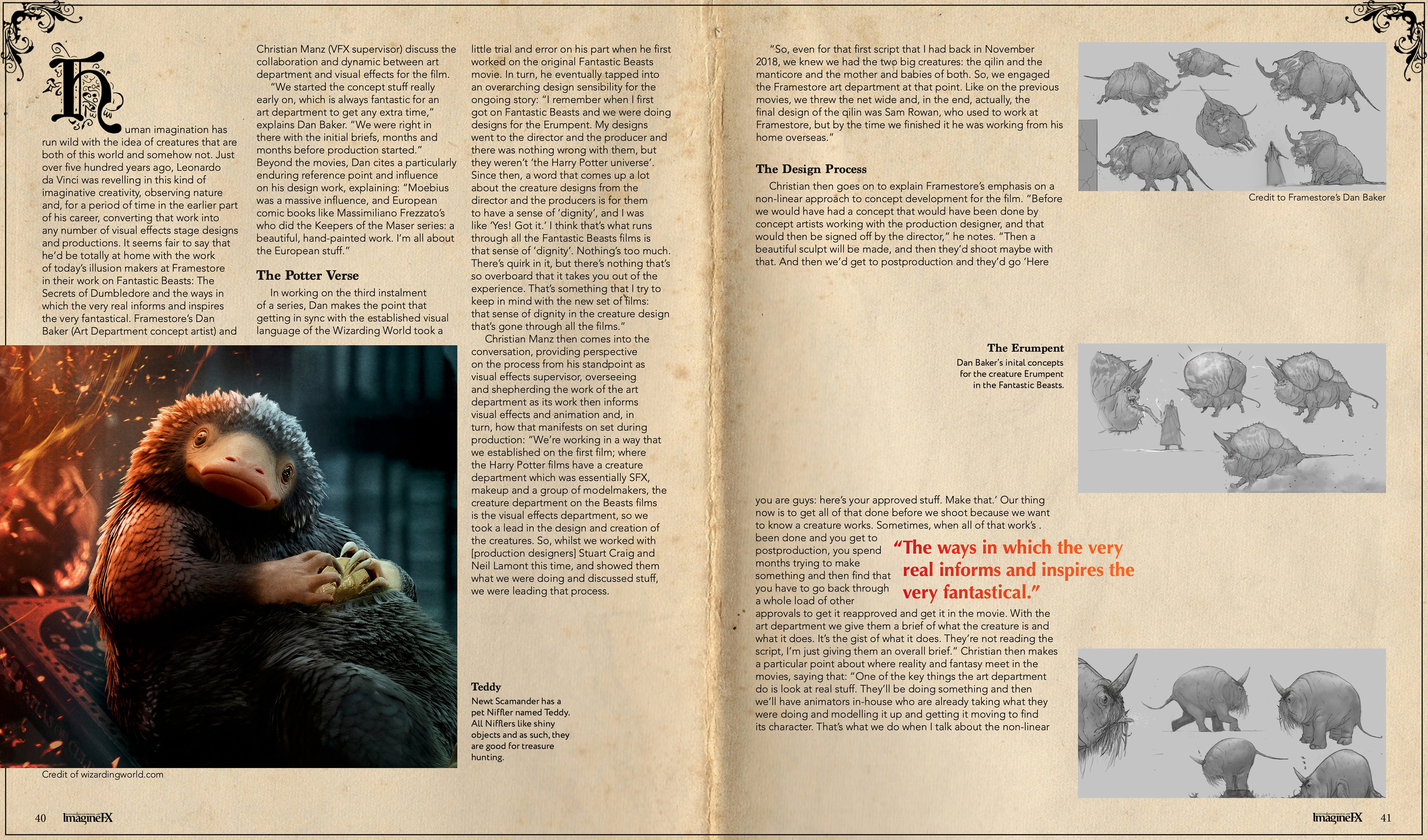
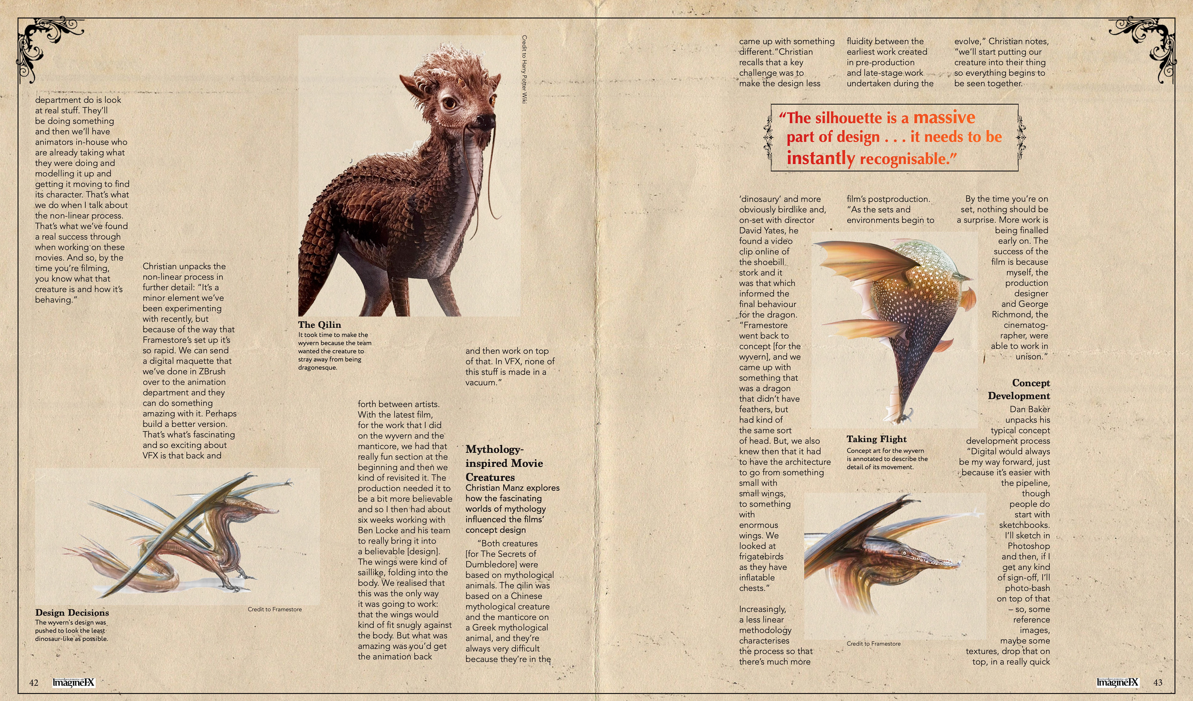
This is the original article from ImagineFX Magazine. I chose this article because it was about the design of the animals and a deeper look into how the movie was made.
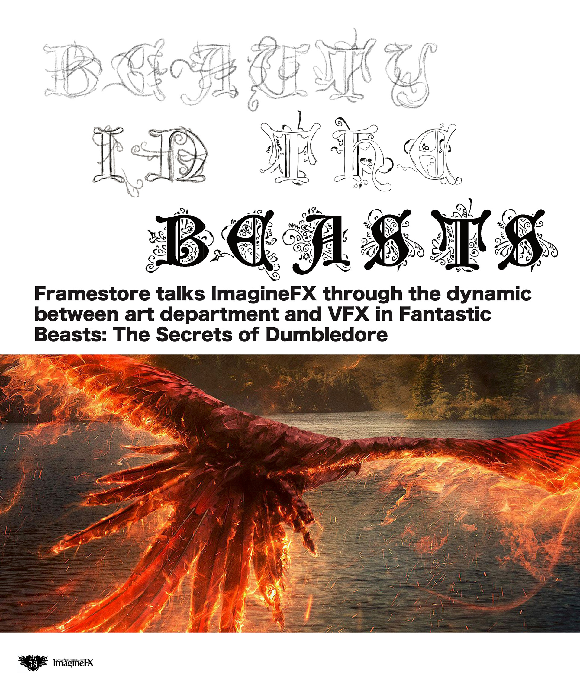
Here are my first iterations of the redesign. The Phoenix came from research about the movie and I was going for a kind of Da Vinci sketchbook look because the article was about the making of the creatures.
Attempt #1 experimenting with different layouts for the body copy.
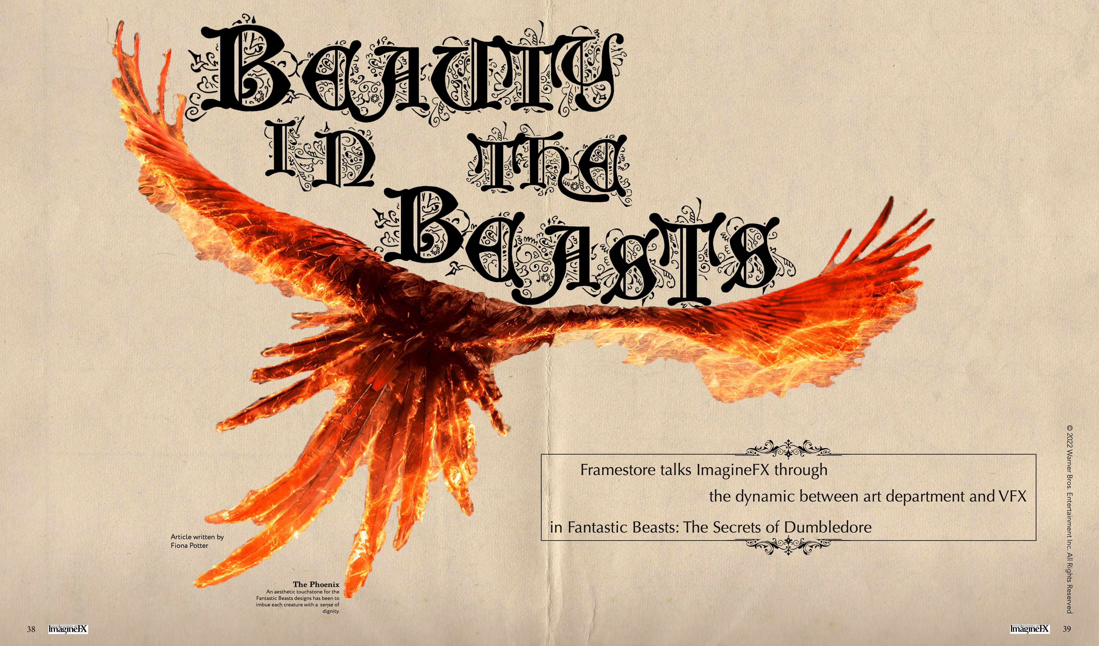
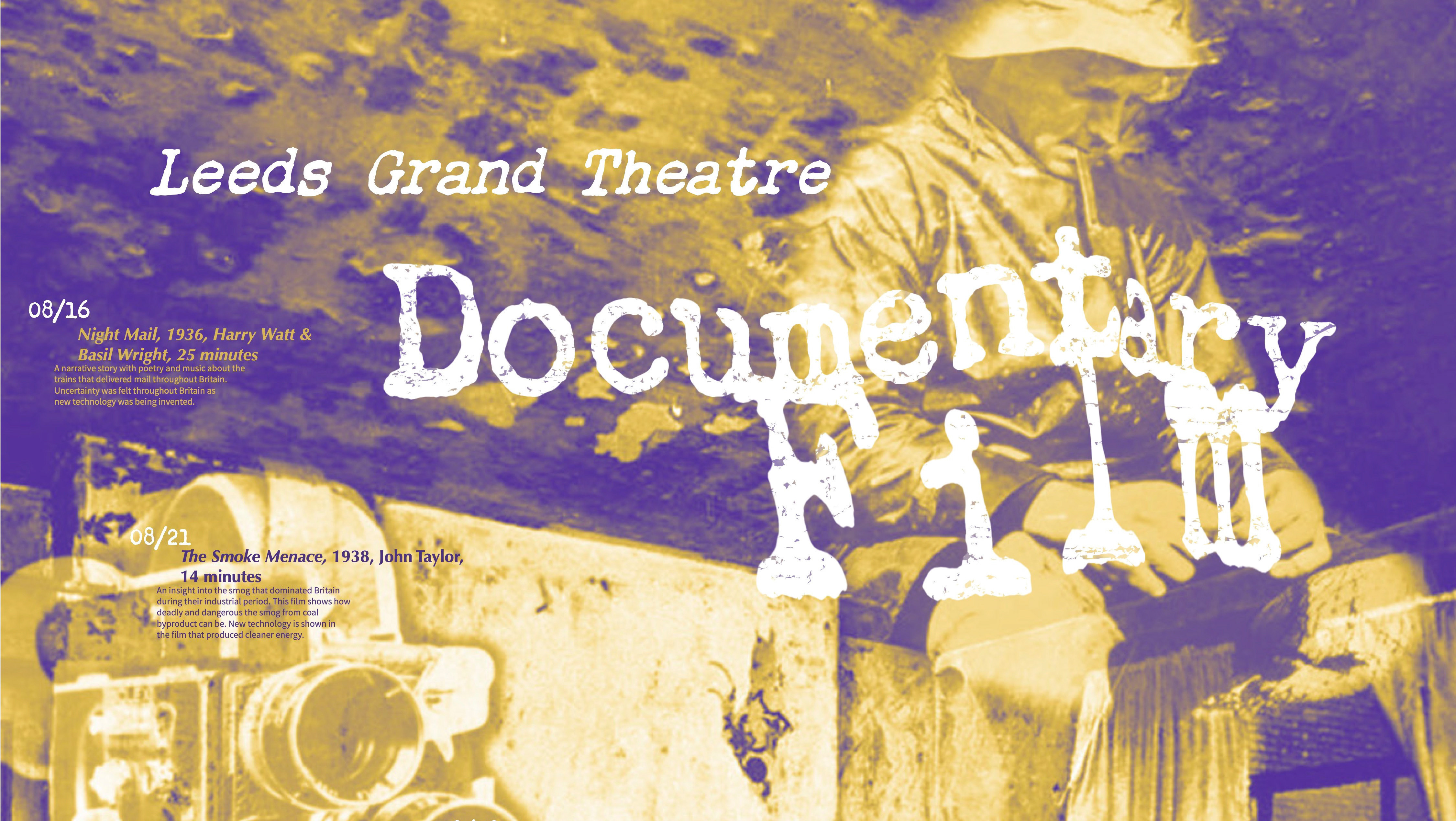
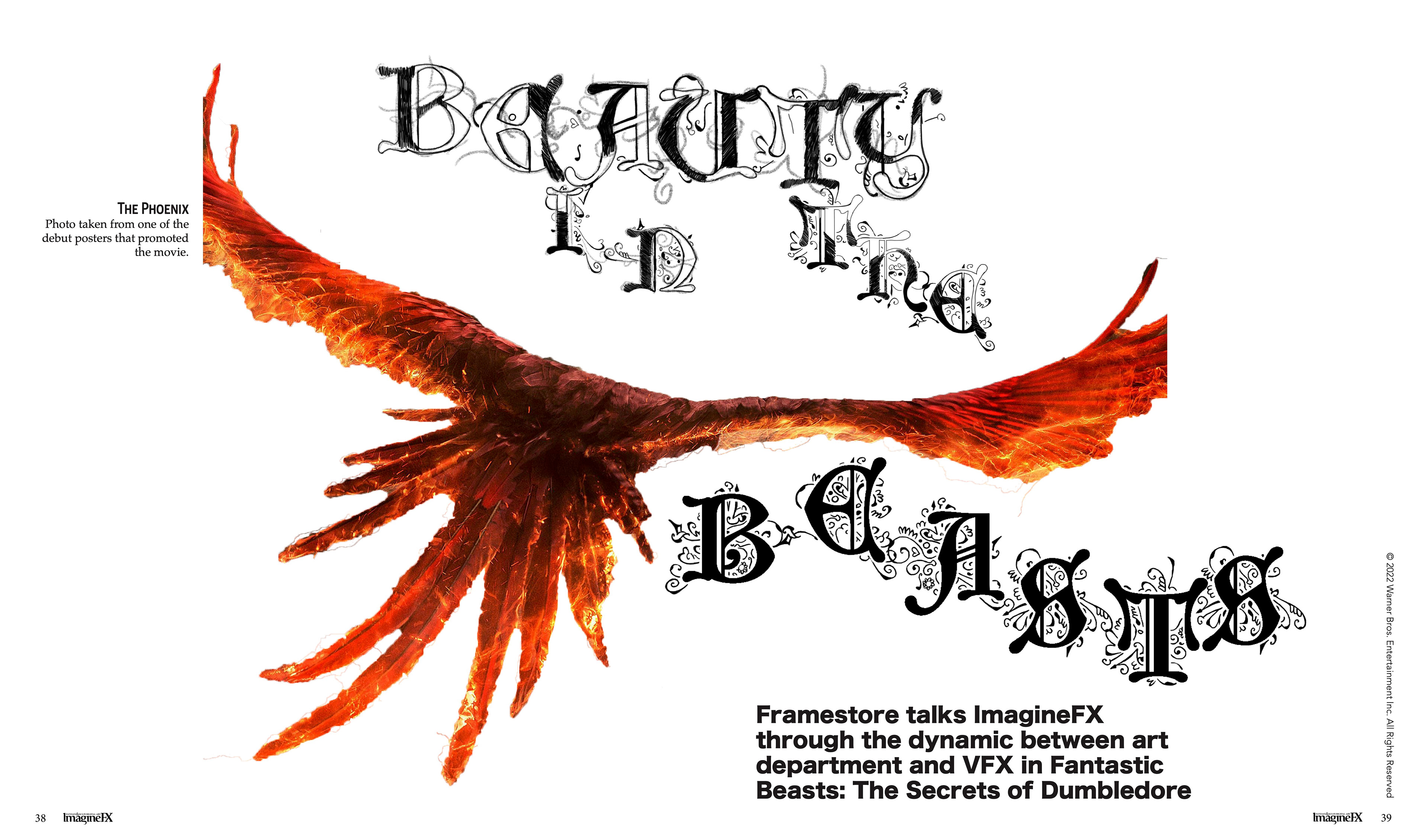
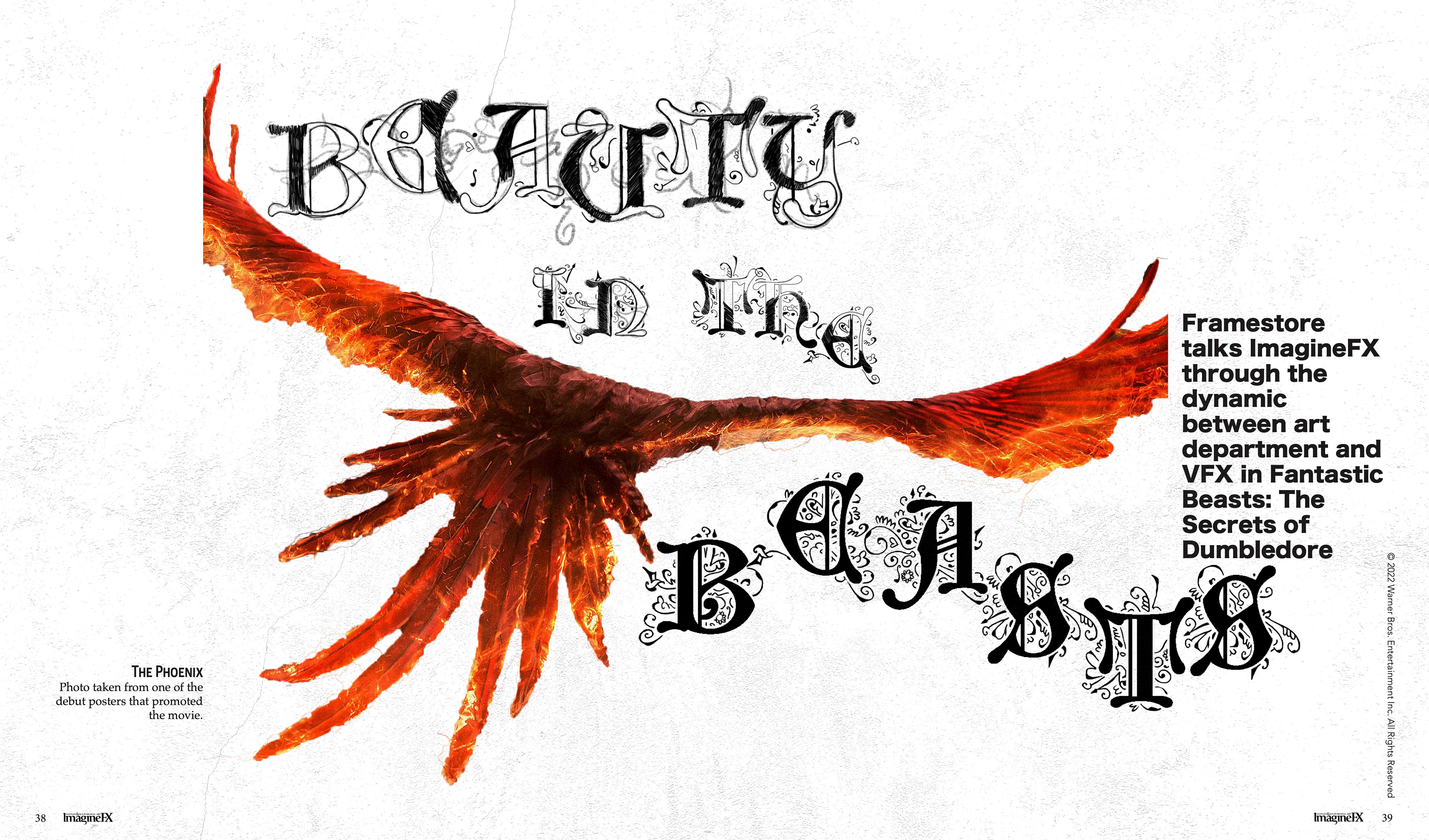
First iteration, First Page.
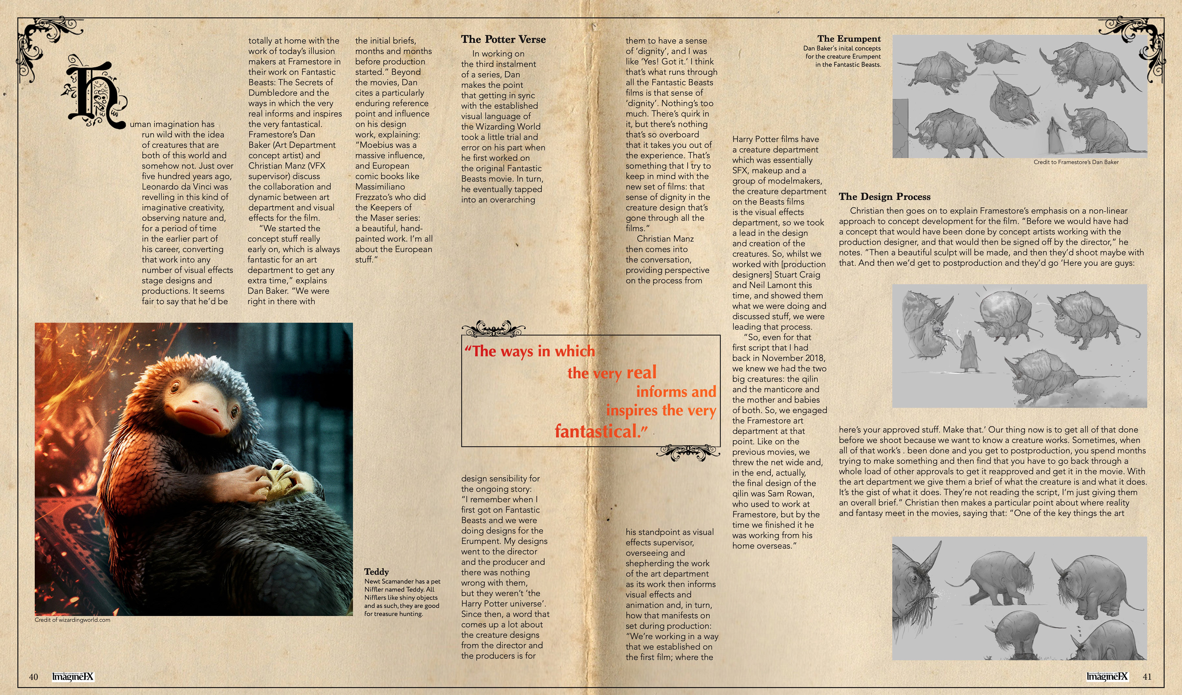
First iteration, Second Page.
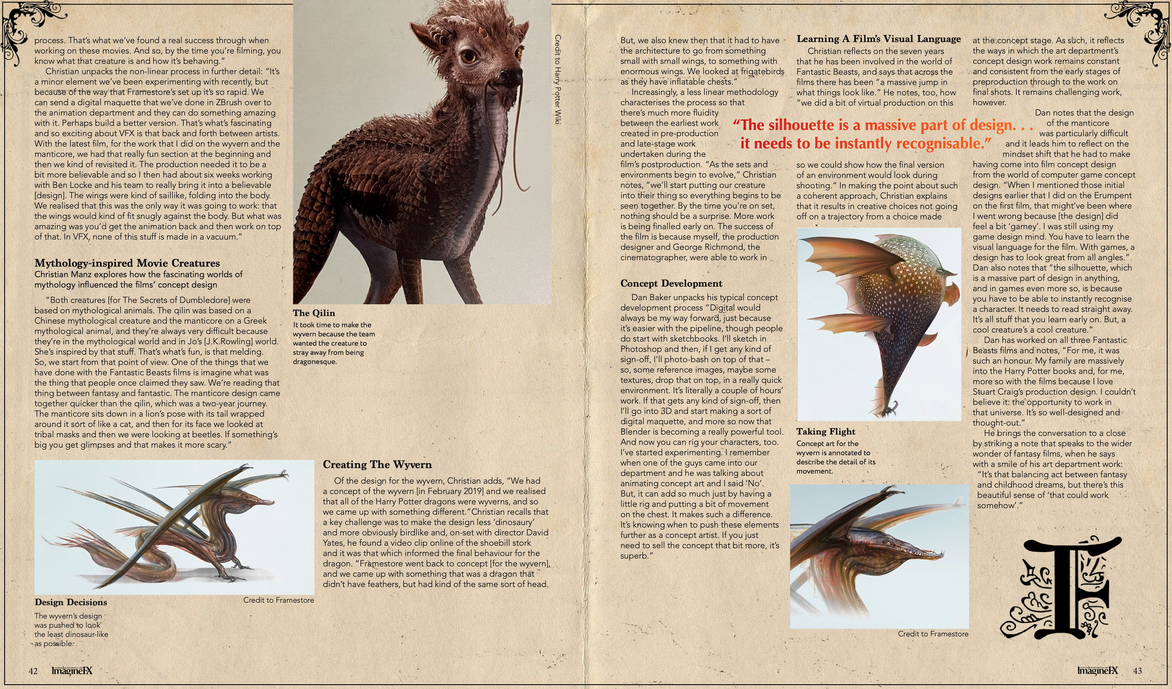
First iteration, Third Page. I really don't know why I put the F there. I know the thought was F as in fin which means like finished which is usually in older films. But it doesn't look good at all and I genuinely don't know why I left it there like that...Maybe to fill in space?
And here are the second to final iterations.
Second iteration, First Page. I really don't know why the box containing the subhead isn't in this iteration but it is on the first. This project was done like 2 years ago.
Second iteration, Second Page. I didn't want to make the photos any smaller than they already were and I wanted them to adhere to some sort of alignment and I also needed the pull text to be somewhere so there was just a lot going on in this page and nothing was working the way I was wanting it to.
Second iteration, Third Page. I really don't know what I was thinking with the ladder like paragraphs on the left, probably just experimenting with different layouts but I still do quite like the right page. It just looks satisfying to me. That being said, it does not match the rest of the article in terms of layout.